Table of contents
This article is my attempt at classifying different basic types of website navigation according to my observations. I know there's a million posts written about it already, but I don't like them.
What this article isn't about
Section titled 'What this article isn't about'It isn't about website "structure". No attention will be paid to what a webmaster thinks their website is structured like. Only how a user moves between pages will be considered.
It isn't about in-text hyperlinks. Every website has those — it's the main feature of the Web. My definition of "navigation" will be limited to strictly lists of links that serve no purpose other than guiding the user.
It isn't a prescription on which type you should use in which situation. You can use any. Don't let a random blog post stop you from exploring your creativity.
It isn't about "search engine optimization". If you think SEO is a good thing, knowing full well the extent of the damage it's done to the Web, you should seriously reconsider your life choices.
Now that I pissed off the only people who'd be interested in reading this, let's cut to the chase.
The archetypes
Section titled 'The archetypes'Not in any particular order.
Comb
Section titled 'Comb'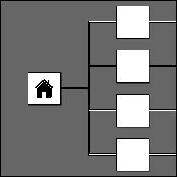
This is the most straightforward type and one of the easiest to implement — it requires little effort as long as you have any template engine. You put a bunch of links to the most important places on every single page, usually in the header, and that's it. If you want to go somewhere less important, you deal with it somehow™, usually by resorting to a different navigation type for a specific section.
Due to being the first thing anyone thinks when hearing the word "navigation", it's hard to give an example of where exactly it's used. Let's just say it's used pretty much everywhere.
Tree
Section titled 'Tree'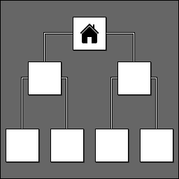
In this type, pages represent nodes in a hierarchy. Like with an actual tree, navigation is done by descending to a child or ascending to a parent, except you do it with links and not by scraping your ass against the bark. Descent is implemented as a list of children pages, and ascent can be implemented either as a "go up" link or as breadcrumbs, depending on how much effort you want to put into it.
As you can tell, this is some weird computer sciency shit that doesn't reflect how normal people organize stuff. For this reason, it's vanishingly rare to see it used for an entire website. It's also, however, the perfect way to represent a filesystem on the Web, which is why it's used in many file directories and indices. And this website too for some reason.
Hairbrush
Section titled 'Hairbrush'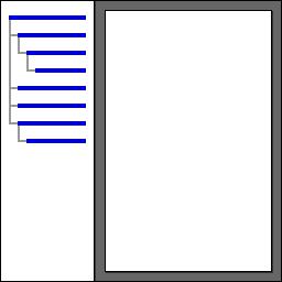
As the name suggests (or so I hope), this is a combination of the previous 2 types. There's still a hierarchy, but instead of pages only having links to their neighbors, they have an entire copy of the hierarchy. Since hierarchies take a lot of space, the links are almost always put in a sidebar, or a header but in a collapsed form.
A typical consumer of this type nowadays is documentation websites, which makes sense because it lets you jump between lots of topics while staying organized. Another place you could've encountered it in is many websites from the late 2000s. They specifically used the "collapsed links in the header" variety which fell out of use, likely as it's unusable on smartphones.
Spawnpoint
Section titled 'Spawnpoint'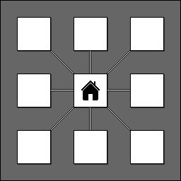
You can consider this one a subtype of the comb navigation where the number of important places is 1. The place in question being, of course, the homepage which contains a map of everything there is on the website. Return to the homepage is implemented as a simple "go home" link unless you're applying it to an existing template made for comb navigation, in which case you end up with an ugly header with a single menu item.
Since you don't need a template engine to implement this type, it's used on a lot of personal websites, especially ones hosted on fully static providers like Neocities. It was common in the '90s as well, for the same reason, among people who didn't want to use frames.
Rabbit hole
Section titled 'Rabbit hole'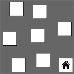
This type can be summarized as "no navigation". There are only in-text hyperlinks, no dedicated navigation sections. As such, you don't "navigate" it, you instead either search or open a funny article like 23 skidoo, start clicking on related terms, and then 5 hours later, realize you dug all the way down to flashbulb memory, arche-writing, and pseudo-Kufic in 3 separate tabs.
Most wikis and some note taking/personal knowledge base websites use this type. Completely understandable because trying to force a single hierarchy of any sort onto hundreds or thousands of pages generally doesn't end up well. It's additionally not totally uncommon to see it on indie websites, especially artsy ones.
Ladder
Section titled 'Ladder'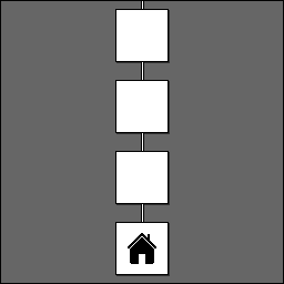
The most limiting type. The pages are arranged sequentially and shown one at a time, with an action required to progress to the next one. That action can be anything from swiping to pretending to be neurotypical so you can get your minimal wage job from a company that really wants to know your personality type. Most of the time, you can go back to the previous page with another action.
TikTok and similar microvlogging (not to be confused with microblogging) platforms use this type to fuel your addiction to Family Guy clips. It's also the go-to for quizzes and authorization forms, but can you truly call these last 2 examples "navigation"? I don't know.
Meat grinder
Section titled 'Meat grinder'
This one also involves no actual navigation, but this time, due to the thing you're looking for already being right there in your face. The pages, if you can still call them that, are all embedded into a single page and seamlessly scrolled through by the user. Like a literal meat grinder, it keeps on working forever as long as you have the meat. Computers and infinities don't mix though, so "forever" is faked with endless scrolling or good ol' pagination.
Image-oriented social media and microblogging platforms, most notably Reddit and the no longer existent Twitter, (ab)use this type extensively. This is the only example needed here as their sheer mass alone accounts for most of the Web.
Conclusion
Section titled 'Conclusion'Something I missed? Your thoughts are welcome.